
Help · Content
Dark mode
What your readers see
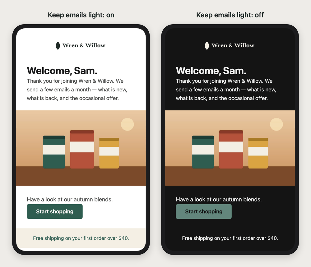
With Keep emails light in dark inboxes on, which is the default, most inboxes show your email light, exactly as you designed it. The Outlook apps darken it whatever it asks. The chart below shows each mail app with the switch on and off, and we recommend leaving it on.
Keep emails light in dark inboxes is a switch in Settings → Store. Here is what a reader with their device set to dark sees, with it on and with it off. The "off" column is for a template that has a dark palette of its own (see Your email's own dark colors, below). A template with no dark palette is always sent light, whichever way the switch is set, so it looks like the "on" column in every inbox. A text-only email is the exception: it names no colors of its own, so with the switch off each reader's mail app draws it in its own light or dark theme, and nothing dark can land on dark:
| Where your email is read | Keep emails light on (the default) | Keep emails light off | Checked on a real device |
|---|---|---|---|
| Apple Mail on iPhone and iPad | Your email, light, as you designed it. | Your dark colors and your logo for dark backgrounds. Buttons you colored yourself keep their colors, and so do links whose color reads on your dark background. | Not yet |
| Apple Mail on Mac | Your email, light, as you designed it. | Your dark colors and your logo for dark backgrounds. Buttons you colored yourself keep their colors, and so do links whose color reads on your dark background. A reader who has told Apple Mail not to use dark backgrounds for messages sees it light. | Yes, on and off: your dark colors, your logo for dark backgrounds with the white strip gone, and a button you colored yourself keeping its color. Links keeping their colors: not yet |
| Gmail app on iPhone | Your email, light, as you designed it. | Gmail darkens it with its own colors. Your regular logo, on a white strip where it sits on white. Never your logo for dark backgrounds. | Yes, on and off, including your logo on its white strip. |
| Gmail app on Android | Your email, light, as you designed it. | Gmail darkens it with its own colors. Your regular logo, on a white strip where it sits on white. Never your logo for dark backgrounds. | Not yet |
| Gmail on the web | Your email as you designed it. | Your email as you designed it. | Not yet |
| Outlook apps (Windows, Mac, iPhone, Android) | Outlook darkens it with its own colors, whatever your email asks. | Outlook darkens it its own way; some versions use your dark colors instead. | Not yet |
| Outlook on the web | Outlook darkens it with its own colors, whatever your email asks. | Outlook darkens it its own way; some versions use your dark colors instead. | Not yet |
| Yahoo Mail | Your email as you designed it. | Your email as you designed it. | Not yet |
"Not yet" means the cell says what that mail app is known to do, not something we have watched it do.
We recommend leaving Keep emails light on.
Disable it only if you have designed dark colors for your emails and accept that the Gmail app makes its own dark version of them.
Why each inbox is different
A lot of the people on your list read email with their device set to dark. You design your email once, but each mail app decides for itself what dark mode means for it. Some show your email exactly as you designed it. Some follow instructions your email carries. And some repaint its colors on their own, whatever your email asks — the Outlook apps among them.
This page explains what happens in each kind of inbox, what can go wrong, what Carpe Messaging does about it for you, and the few things worth checking yourself.
How common dark mode is
Common enough to plan for. Many people keep their device dark all the time or on a schedule, and mail apps follow the device. The figures below are best estimates from surveys, not a measurement of your own list.
Dark mode is not a niche setting. When one technology site asked its readers in 2026, almost nine in ten said their device is in dark mode all the time or on a schedule, and only about 6 percent said they never use it. Those are readers of a technology site, so the share across your list is likely lower. One company that measures how email is opened reported that about a third of the emails it could track in 2022 were opened in dark mode, up from the year before.
Three things make it more common than it looks:
- Many devices go dark on their own. An iPhone set to Automatic turns dark every evening, so the same person can read your morning email light and your evening email dark.
- Mail apps follow the device. The Gmail app and the Outlook apps use the device's own setting unless the reader changes it, so a reader never has to choose dark mode in the mail app for it to be on.
- Some devices go dark to save battery. On some Android devices, turning on battery saver turns the Gmail app dark too.
So plan for every email you send to be read both ways.
What an inbox can do with your email
Every inbox does one of three things when the reader's device is set to dark: it leaves your email alone, it follows your email's own instructions, or it repaints your colors itself. Which one depends on the mail app, not on you.
It leaves your email alone. The inbox around it goes dark, but your email is drawn exactly as you designed it, white background and all. Gmail on the web does this, and so does Yahoo Mail.
It follows your email's instructions. An email can carry two kinds of instruction for dark mode: "keep me light", or "here are my dark colors". Apple Mail on iPhone, iPad and Mac reads both. An email that says neither may be darkened by Apple Mail on its own; one that says "keep me light" stays light. Carpe Messaging never sends a designed email that says neither: a template with no dark palette always says "keep me light". A text-only email says neither on purpose while the switch is off — it names no colors, so the reader's own theme colors it. The Gmail app reads "keep me light" too — on iPhone we have watched it, and on Android the published support charts say so: an email that asks for it stays light, and one that does not is repainted, as below.
It repaints your email. The inbox ignores your email's dark colors and its "keep me light", and works out new colors itself: light backgrounds turn dark, dark words turn light, and your brand colors shift to whatever it thinks will read. The Outlook apps do this, and so does the Gmail app when your email does not ask to stay light. Two things about repainting matter more than anything else on this page:
- It repaints every background color, even a soft off-white. In our own tests on an iPhone, with the email not asking to stay light, the Gmail app darkened every colored background in the email. A white that is not quite white is still a color.
- It never repaints an image. An image is drawn exactly as it was made — which is both the problem (a dark logo on a see-through background) and the fix (a white background that is part of an image).
The chart at the top of this page shows which mail app does which.
A reader can undo it for one email in some of these. Outlook has a button at the top of a message that switches its background between light and dark, and the reader can disable dark mode in any of these apps' own settings. You cannot disable it for them.
What goes wrong in a repainting inbox
A repainting inbox darkens every background and lightens dark words, but never touches an image. So a dark logo on a see-through background can all but vanish, and colored boxes and buttons lose your palette. The words usually stay readable.
Here is the same welcome email, for a sample store, as it was designed and as a repainting inbox draws it:
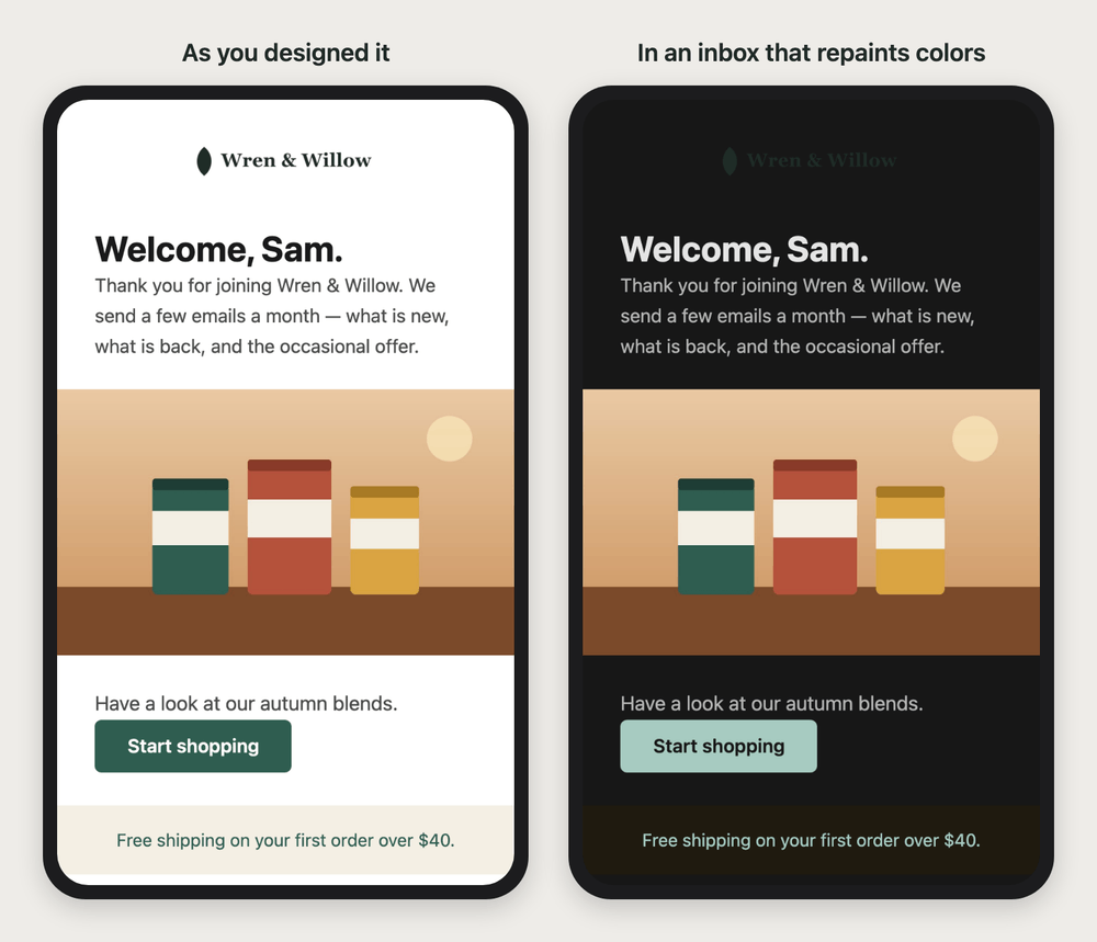
What to look for:
- A dark logo on a see-through background disappears. The background it was made for has been repainted dark, and the logo — an image — was not. This is the most common casualty, and it is your name at the top of the email.
- A logo with its own white box stays readable, but shows as a white rectangle on a dark page. Not beautiful, never invisible.
- The edges of a see-through logo can show a pale fringe, when the logo was smoothed against white and is now drawn on dark.
- A colored box changes color. A cream band behind a line of text becomes a dark, muddy band, and its words change color with it. The words stay readable; your palette does not survive.
- A button's color changes. A dark button turns pale and its words turn dark. Usually still readable, rarely on brand. A button drawn as an image keeps its colors, because an image is never repainted.
- Dark words or icons inside an image vanish if the image has a see-through background — black social icons, a signature in dark ink, a diagram drawn on nothing.
- Colors written inside a block of pasted HTML are repainted like everything else here. In an inbox that follows your email's dark colors, they are the one part that does not change — see the Email templates page, A block of pasted HTML.
What Carpe Messaging does for you
Every email you send asks to stay light while Keep emails light in dark inboxes is on, which it is until you disable it. An image on plain white can keep a white strip behind it that no inbox repaints, and a new template made in your brand has one behind its logo already. Images are never changed.
Keep emails light in dark inboxes
Settings → Store has a switch called Keep emails light in dark inboxes, and it is on for every store until you disable it. While it is on, every email you send asks to be shown in its own light colors:
Your emails ask to be shown in their own light colors, even on a device set to dark. Apple Mail and the Gmail app do as asked. The Outlook apps darken email on their own, whatever this says.
It is on by default because an email you designed light, shown light, is the one you have actually looked at. Disable it only if you have designed dark colors for your emails and accept that the Gmail app makes its own dark version of them. With it off, the switch says:
Apple Mail shows your emails in their dark colors, with each image’s image for dark inboxes if it has one. Buttons you colored yourself keep their colors. The Gmail app darkens email with its own colors instead and always shows your regular images. A template with no dark palette is still sent light, unless it is text only.
The switch is read each time an email is prepared: a campaign that is already scheduled keeps the answer it had when it was scheduled. So does the white strip behind an image that has an image for dark inboxes (below): in a campaign scheduled before we started adding that strip on its own, such an image has one only if its own Keep a white background in dark inboxes was on — as it is for the logo in new templates made in your brand. Without it, the Gmail app shows a see-through image there on its own dark colors. Schedule the campaign again to give it the strip.
A white strip behind your logo
This is what protects your logo wherever an inbox repaints your email — the Outlook apps, and the Gmail app once Keep emails light in dark inboxes is off for a template with a dark palette. An image's panel in the editor has a card called Keep a white background in dark inboxes:
Keeps a white strip behind this image, even where an inbox darkens the email — the Gmail app included. Use it for a logo with a see-through background.
The strip is drawn as a white color and as a white image behind your image, so an inbox that repaints colors still leaves it white. Your logo stays on the background it was made for, and the rest of the email goes dark around it:
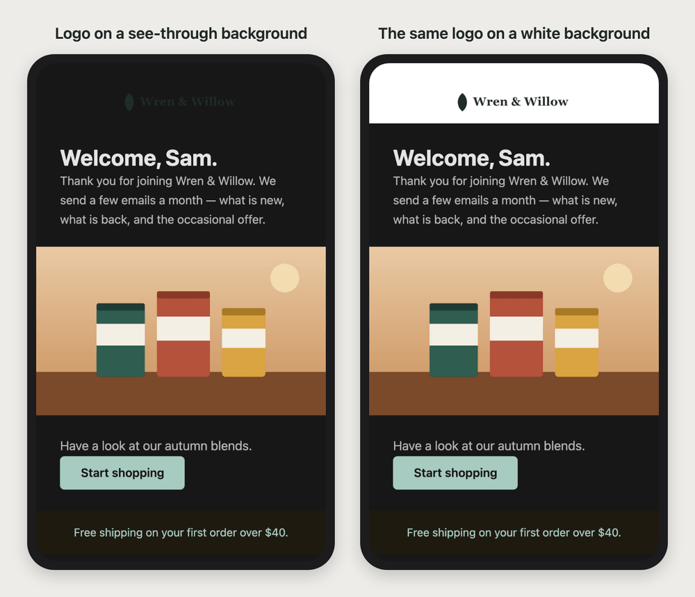
It is drawn only where the image already sits on plain white — a white section with no image, color, border or box of its own around the image. There, a light inbox shows nothing new. Anywhere else a white strip would show in every inbox, so it is not drawn, and the card says so.
An image with an image for dark inboxes has it without asking. Where such an image sits on plain white, the white strip is kept behind it whatever the switch says, and the card says so instead of offering the switch:
A white background is kept behind this image while it has an image for dark inboxes. The Gmail app shows this image on the white; an inbox that shows your dark colors shows the image for dark inboxes instead.
So one image carries both answers: the Gmail app, which never swaps an image, shows your regular logo on white, and Apple Mail, once Keep emails light in dark inboxes is off, takes the strip away and shows your logo for dark backgrounds on your dark colors. On a colored section there is no strip — it would be a white bar in every inbox — so there the Gmail app shows your regular logo on the color it repaints.
New templates made in your brand have it already. When New templates use your brand settings is on, the logo band at the top of every new template keeps a white background in dark inboxes. Templates you made before, and imported templates, keep what they had — enable it for the logo in each one you still use.
A logo for dark backgrounds
Settings → Store has a second logo box, Logo for dark backgrounds, for a light version of your logo — white or pale lettering made to sit on a dark color. In an email, an image can carry an Image for dark inboxes the same way, on its panel in the editor.
It is shown only where both of these are true: Keep emails light in dark inboxes is off, and the inbox shows your email's dark colors — Apple Mail does. A white strip behind the image does not stop it: that inbox takes the strip away too. Gmail always shows the regular image, on the web and in its apps, because the Gmail app does not read an email's dark colors at all.
Your email's own dark colors
A template can carry its own colors for a dark inbox: in the editor, under Email, Design a dark palette sets the colors an inbox that follows your email uses in dark mode. A new template made in your brand uses a lighter shade of your primary color on its buttons in a dark inbox, so their words stay readable — unless your primary color is too light for white words, in which case the buttons keep it. Your dark colors are used only while Keep emails light in dark inboxes is off. Without a dark palette, the template is always sent light: it asks every inbox to keep it light, whatever the switch says, so Apple Mail never darkens it on a guess. A text-only email has no palette to design: see Text-only emails, below.
Buttons and links you colored yourself
A button that uses your template's accent color — as its color, or as the color of its words on a button the color of your page, the way an outline button does — takes your dark accent in an inbox that shows your dark colors, with words in your dark background color. So does a see-through button, because its words were chosen for your light page. A button you gave a solid color of its own keeps it — its color, its words and its border, even when its words are your accent color — so a pink button stays pink on your dark colors, exactly as you chose it. Only its shadow, if it has one, darkens with the page.
That means a button close to your dark background color blends into it in a dark inbox: a near-black button on a near-black page shows only its words. We never change a color you chose, so pick a button color that stands out on your dark background as well as on your light one.
Links keep the color you chose under Links where that color reads on your dark background as clearly as body text needs to. Where it does not — a dark or medium blue on a near-black page, say, or a see-through color — they take your dark text color, and the underline is what still marks them.
An inbox that repaints your email repaints buttons and links too, whatever you chose; see What goes wrong in a repainting inbox, above.
Words you set in a color of their own (the A in the text controls) keep that color in a dark inbox that follows your email when it is still easy to read on your dark background. A color that would be hard to read there, such as navy on near-black, turns the same light color as the words around it.
Images are never changed
Nothing Carpe Messaging does in dark mode alters an image, and neither does any inbox's repainting. That is why the white strip works — and why an image is the one part of your email you can count on looking the same everywhere.
Text-only emails
A text-only email names no colors of its own, so a reader's mail app shows it in its own colors, light or dark. There is nothing to set, and nothing can end up dark on dark. It is the one email that does not ask to stay light when it has no dark palette: with Keep emails light in dark inboxes off, it leaves the choice to the reader's mail app. See the Text-only emails page.
Your unsubscribe page, and the back-in-stock cancel page
The page a person reaches from your unsubscribe link, and the page where they cancel a back-in-stock request, each have their own dark version. A browser does show a page's dark version exactly as drawn, so on a device set to dark these pages switch to it, with your logo for dark backgrounds — or your store logo on a white strip if you have none. Keep emails light in dark inboxes does not change them. See the Unsubscribe page page.
Seeing it before you send
In the editor, and on a campaign's email step, the crescent-moon button beside the desktop and mobile buttons shows your email in its dark colors — what an inbox that follows your email draws. While Keep emails light in dark inboxes is on, the button is grayed out, because your email arrives light:
Your store keeps emails light in dark inboxes, so this email arrives light. You can change that in Settings → Store.
The preview cannot show you a repainting inbox, because each one works out its own colors. The only way to see what the Gmail app does to your email is to look: Send a test to yourself, set your mobile device to dark, and open the test in the Gmail app and in Apple Mail.
Can I make the Gmail app keep my email light?
On iPhone, yes: leave Keep emails light in dark inboxes on. We sent the same email to the Gmail app on an iPhone set to dark, twice. With the switch on, it showed the email exactly as designed, white background and all. With it off, it repainted the email dark.
On Android we have not been able to test it, so plan for the Gmail app there to repaint your email whatever it asks. There are tricks that fool one version of one app and break the email in another; we do not use them. What works in every inbox is what is already on this page: a white strip behind your logo, and a logo that is never dark ink on a see-through background.
A short checklist
Leave Keep emails light in dark inboxes on, give every logo a white strip or a light background of its own, and read a test with your device set to dark before a campaign you care about. In full:
- Leave Keep emails light in dark inboxes on, unless you have designed dark colors and want Apple Mail readers to see them. It also keeps your email light in the Gmail app on iPhone.
- Give your logo a white strip in every template you use — new templates in your brand have one already, and so does any image with an image for dark inboxes — or upload a logo that has its own white or light background.
- Never rely on dark ink on a see-through background, in a logo or any other image. It is invisible wherever the email is repainted.
- Choose a logo for dark backgrounds if you disable Keep emails light, so Apple Mail readers see a light logo on your dark colors.
- Keep social icons in Full color, so they show on a band that has been darkened.
- Send yourself a test and read it dark — in the Gmail app and in Apple Mail — before a campaign you care about.